
Specialized browser APIs
Keep custom code for interfaces that rely on browser APIs or third-party controls the A2UI runtime does not expose.
Migrating to A2UI means translating an interface into a normalized component tree and moving behavior into named Flow Events. It is not a source-to-source React compiler: arbitrary JavaScript, browser APIs, and component-local effects do not run inside an A2UI surface.
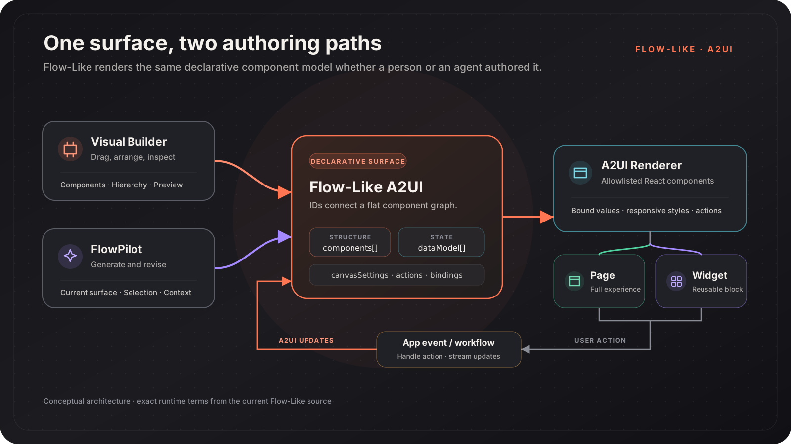
Use A2UI when the interface should be generated, edited visually, shared between Pages and Widgets, or driven directly by Flow-Like workflows. Keep a custom web frontend when the experience depends on unsupported browser behavior or a specialized third-party UI library.
| Existing UI concern | A2UI equivalent |
|---|---|
| DOM or JSX hierarchy | Flat components array plus child ID references |
| Component props | Typed properties directly inside component |
| React state | Bound values, Page state, global state, or element values |
| Event handler | Board Event selected by a workflow_event action and nodeId |
| Repeated interactive component | Reusable Widget and widgetInstance |
| CSS module or inline CSS | style.className and structured style fields |
| Client-side route change | navigate_page action or a route Event |
| API call in the component | Flow nodes behind a named Event |
Inventory the interface
Identify layout containers, visible values, inputs, actions, repeated patterns, loading states, and navigation. Separate presentation from the code that fetches or mutates data.
Choose the target surface
Use a Page for routeable app UI and a Widget for a reusable surface.
Create the target from the relevant Flow so it retains the Flow’s
boardId.
Build the static hierarchy
Recreate the structure with column, row, grid, card, and other
current components. Give every component a stable semantic ID.
Move values into bindings
Use literal BoundValue objects for static copy and path bindings for
shared data. Inputs keep their current value on the element; workflows can
read or update it through element nodes.
Replace handlers with board Events
Create one Event per purpose, connect it to the relevant handler Flow, and
select it on the interactive component. The builder emits a
workflow_event action whose context.nodeId identifies the Event. The
handler reads live values instead of receiving a copied form payload.
Extract repeated UI into Widgets
Repeated cards, rows, and action groups should use widgetInstance rather
than duplicated component trees. Declare interactive action IDs in the
Widget definition, then bind them when each Widget is instantiated.
Verify both themes and runtime paths
Test the visual builder, rendered Page or Widget, loading and error states, keyboard navigation, light and dark mode, and every route or Event binding.
The React version combines layout, local state, and a submit handler:
function ProfileCard() {  const [email, setEmail] = useState("");
  return (    <section className="rounded-xl border p-6">      <h2>Profile</h2>      <input        type="email"        value={email}        onChange={(event) => setEmail(event.target.value)}      />      <button onClick={() => saveProfile(email)}>Save profile</button>    </section>  );}
The A2UI surface keeps presentation declarative:
{ "rootComponentId": "root", "components": [ { "id": "root", "style": { "className": "rounded-xl border border-border bg-card p-6 text-card-foreground" }, "component": { "type": "column", "gap": { "literalString": "16px" }, "children": { "explicitList": ["heading", "email", "save"] } } }, { "id": "heading", "component": { "type": "text", "content": { "literalString": "Profile" }, "variant": { "literalString": "heading" }, "size": { "literalString": "xl" }, "weight": { "literalString": "semibold" } } }, { "id": "email", "component": { "type": "textField", "value": { "literalString": "" }, "label": { "literalString": "Email address" }, "inputType": { "literalString": "email" }, "required": { "literalBool": true } } }, { "id": "save", "component": { "type": "button", "label": { "literalString": "Save profile" }, "actions": [ { "name": "workflow_event", "context": { "nodeId": "save-profile-event-node" } } ] } } ]}The Event selected by save-profile-event-node uses Get Element Value for
the email element, validates it, performs the storage or API operation, and
updates the surface with element setter nodes.
| HTML or React pattern | A2UI component |
|---|---|
<div> / <section> | box, column, row, grid, or card |
| Heading, paragraph, label | text |
| Rich text | markdown |
<img> | image |
<video> | video |
| Status chip | badge |
| Avatar or user summary | avatar or userProfile |
<button> | button |
<a> | link or appLink |
<input> / <textarea> | textField |
<select> | select |
| Checkbox or toggle | checkbox or switch |
| Radio buttons | radioGroup |
| Date or time input | dateTimeInput |
| File upload | fileInput, imageInput, or voiceInput |
| Table | table |
| Dialog | modal or drawer |
| Tabs | tabs |
| Disclosure list | accordion |
| Chart | nivoChart or plotlyChart |
| Calendar or project timeline | calendar or gantt |
| Map | geoMap |
See the component reference for the complete 71-component catalog.
Choose the narrowest state mechanism that fits the data:
| State | Use it for |
|---|---|
| Literal component property | Static design-time content |
| Element value | Current input or component value |
Surface dataModel binding | Shared data used by several components |
| Page state | State that belongs to one Page |
| Global state | State intentionally shared across Pages |
| Runtime Variable | Deployment-specific public or secret configuration |
For workflow-driven display updates, prefer the targeted nodes:
Use a general data-model update only when the surface deliberately binds
several components to the same $.data.* path.
There is no standalone List component in the current catalog. For a dynamic
collection:
$.item.*.widgetInstance.Template children remain useful for simple, non-interactive repetition, but a Widget is the safer choice when an item has buttons, exposed styling, or its own action contract.
Start from semantic theme tokens:
{ "className": "grid grid-cols-1 gap-4 rounded-xl border border-border bg-card p-4 text-card-foreground md:grid-cols-2 lg:grid-cols-3"}This adapts to theme and viewport changes without hard-coding separate light and dark palettes. Structured style fields are available for backgrounds, borders, shadows, sizing, spacing, positioning, transforms, typography, and responsive overrides.
Avoid copying a large application stylesheet wholesale. Move only the rules that establish hierarchy, spacing, responsive behavior, and meaningful visual state.
Specialized browser APIs
Keep custom code for interfaces that rely on browser APIs or third-party controls the A2UI runtime does not expose.
Unbounded client logic
Effects, timers, and arbitrary client-side state machines should become Flow logic or stay in a custom frontend.
Pixel-specific canvases
Use the 2D and 3D components when they fit; retain a purpose-built renderer when exact custom drawing behavior is essential.
BoundValue shape.