
Create reusable Widgets
Enable Developer Mode to see this workspace in the App navigation.
Widgets are reusable A2UI component trees that belong to an app. Use a Widget when the same interface pattern should appear more than once, such as a status card, navigation block, or compact form.
Unlike a built-in component such as Text or Button, a Widget can combine many components, carry its own data model, and expose selected properties for each instance to customize.
Manage Widgets
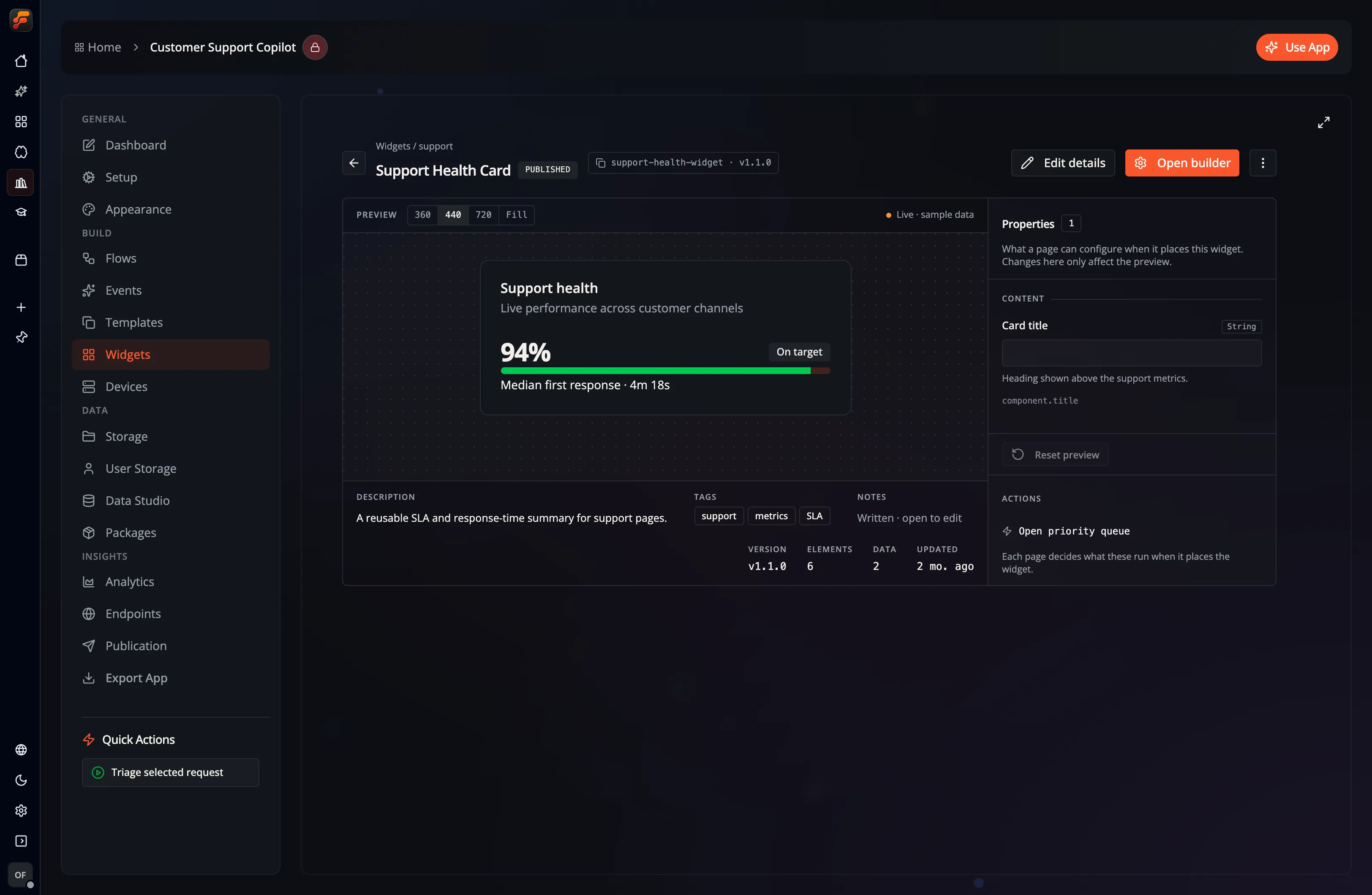
Section titled “Manage Widgets”Open an app and select Widgets. The Widget list shows the reusable interfaces available in that app.
Select Create Widget to add one. Give it a clear name and description so other builders know where it should be used. Selecting an existing Widget opens its details view, where you can:
- inspect the rendered Widget Preview;
- edit its name, description, tags, and detailed description;
- review the properties that are configurable on each instance;
- see its component count, data entries, and current version.
Build a Widget
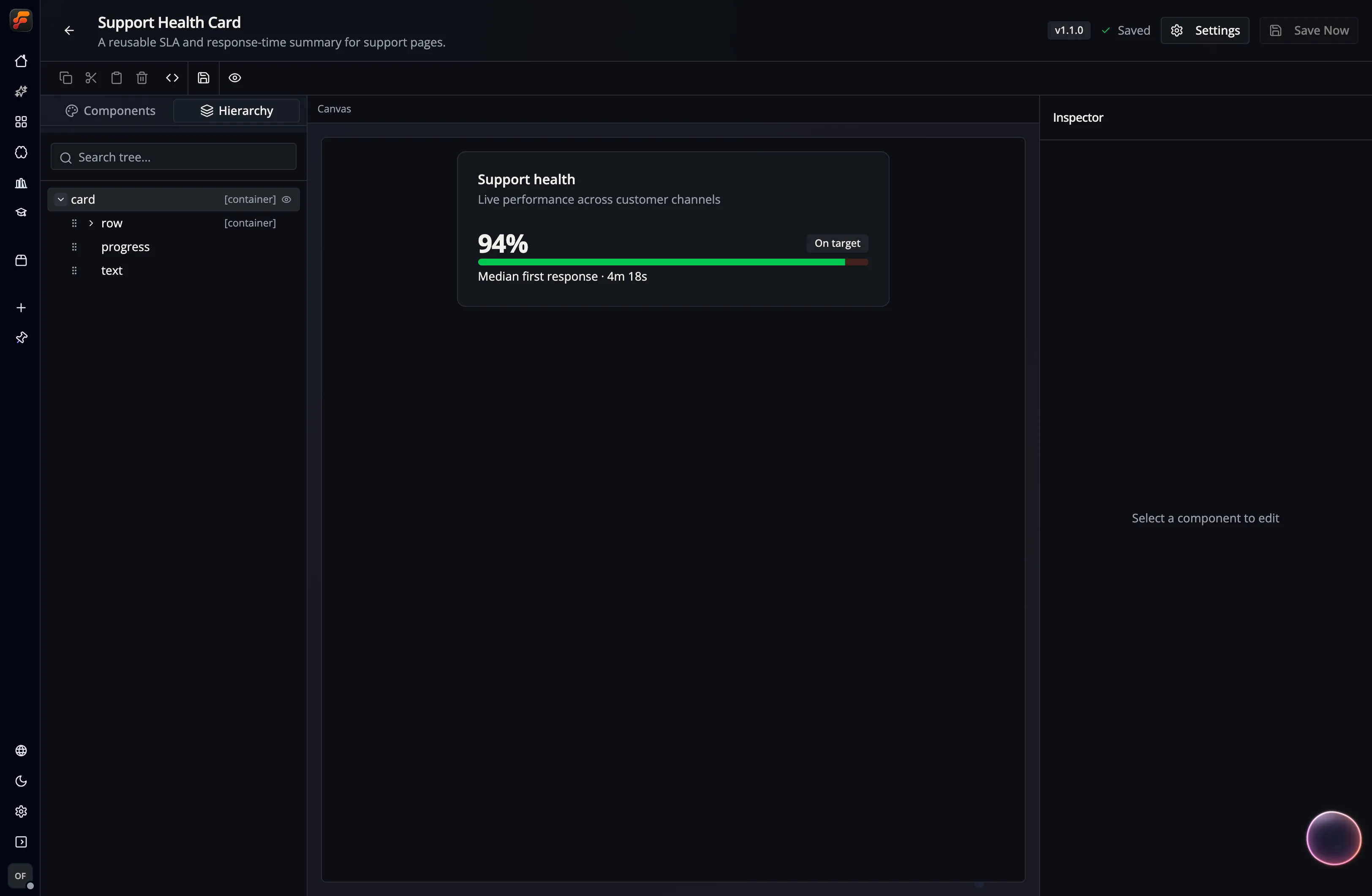
Section titled “Build a Widget”Select Open Builder from the Widget details view. The visual Widget Builder uses the same three-part workspace as the Page Builder:
- Components / Hierarchy: add components and inspect their nesting.
- Canvas: arrange and preview the Widget.
- Inspector: edit the selected component’s content, layout, style, bindings, and actions.
The toolbar includes copy, cut, paste, and delete controls, plus Dev Mode for the underlying JSON, Save, and Preview.
Make a Widget configurable
Section titled “Make a Widget configurable”An exposed property connects a friendly option on the Widget instance to a property on one of the Widget’s components. For example, a status-card Widget could expose:
| Instance option | Target inside the Widget |
|---|---|
| Heading | the content property of a Text component |
| Accent | a color or style property on the outer Card |
| Value | a bound value used by the metric Text |
| Show details | a Boolean property controlling optional content |
Each Widget instance on a Page can supply different exposed-property values without changing the Widget definition. The runtime supports these overrides, but the current Page Builder does not mount the dedicated instance inspector; normal insertion starts with empty overrides and bindings. See Widget runtime and bindings for the integration contract and current authoring limits.
Only expose choices that are useful to the person composing the Page; keep internal layout details private unless they need per-instance control.
Data and events
Section titled “Data and events”A Widget can include a data model for values used by its components. In the Inspector, a supported property can use a fixed literal or bind to a path in that model.
The Events tab in Widget Settings defines named events that elements inside the Widget can trigger. When the Widget is instantiated, those events can be bound to workflows. This keeps the reusable interface independent from the specific Flow that handles an interaction.
Widget Settings
Section titled “Widget Settings”Select Settings in the builder header to manage the Widget itself:
- General: name, description, and tags.
- Events: named events that Widget elements can trigger.
- Versions: load an existing snapshot or create a Patch, Minor, or Major version from the current state.
- Advanced: IDs, timestamps, component count, and data-model size.
Creating a version saves the current changes and records a snapshot. Use a Patch version for a compatible correction, a Minor version for a compatible addition, and a Major version when existing uses may need review.
Design guidance
Section titled “Design guidance”- Keep the Widget focused on one reusable job.
- Use theme tokens such as
bg-cardandtext-muted-foregroundso it remains readable in light and dark mode. - Provide useful default content and test empty, long, and narrow states.
- Name exposed properties for the Page author, not for the internal component implementation.
- Define a Widget event when behavior should be supplied by the containing Page or Flow.
What’s next?
Section titled “What’s next?”- Pages: compose Widgets into full interfaces
- Custom UI (A2UI): understand the underlying interface model
- Widget Builder Guide: use the builder in detail