
Use Semantic Headings
Structure your content with proper heading hierarchy (h1 → h2 → h3).
Flow-Like’s rich-text editor and read-only Markdown renderer support standard Markdown plus several Flow-Like code-block extensions. Individual product surfaces can choose which editor controls they expose.
# Heading 1## Heading 2### Heading 3#### Heading 4##### Heading 5###### Heading 6| Syntax | Result |
|---|---|
**bold** | bold |
*italic* | italic |
~~strikethrough~~ | |
***bold italic*** | bold italic |
`inline code` | inline code |
- Item one- Item two - Nested item - Another nested item- Item three1. First item2. Second item 1. Nested numbered 2. Another nested3. Third item- [x] Completed task- [ ] Incomplete task- [ ] Another task[Link text](https://example.com)Use backticks for inline code: `const x = 42`
Use triple backticks with an optional language identifier for syntax highlighting:
```javascriptfunction greet(name) { return `Hello, ${name}!`;}```Supported languages include: javascript, typescript, python, rust, json, html, css, bash, sql, and many more.
| Header 1 | Header 2 | Header 3 ||----------|----------|----------|| Cell 1 | Cell 2 | Cell 3 || Cell 4 | Cell 5 | Cell 6 || Left | Center | Right ||:-----|:------:|------:|| L | C | R |> This is a blockquote> It can span multiple lines
> Nested blockquotes>> Are also supported---or
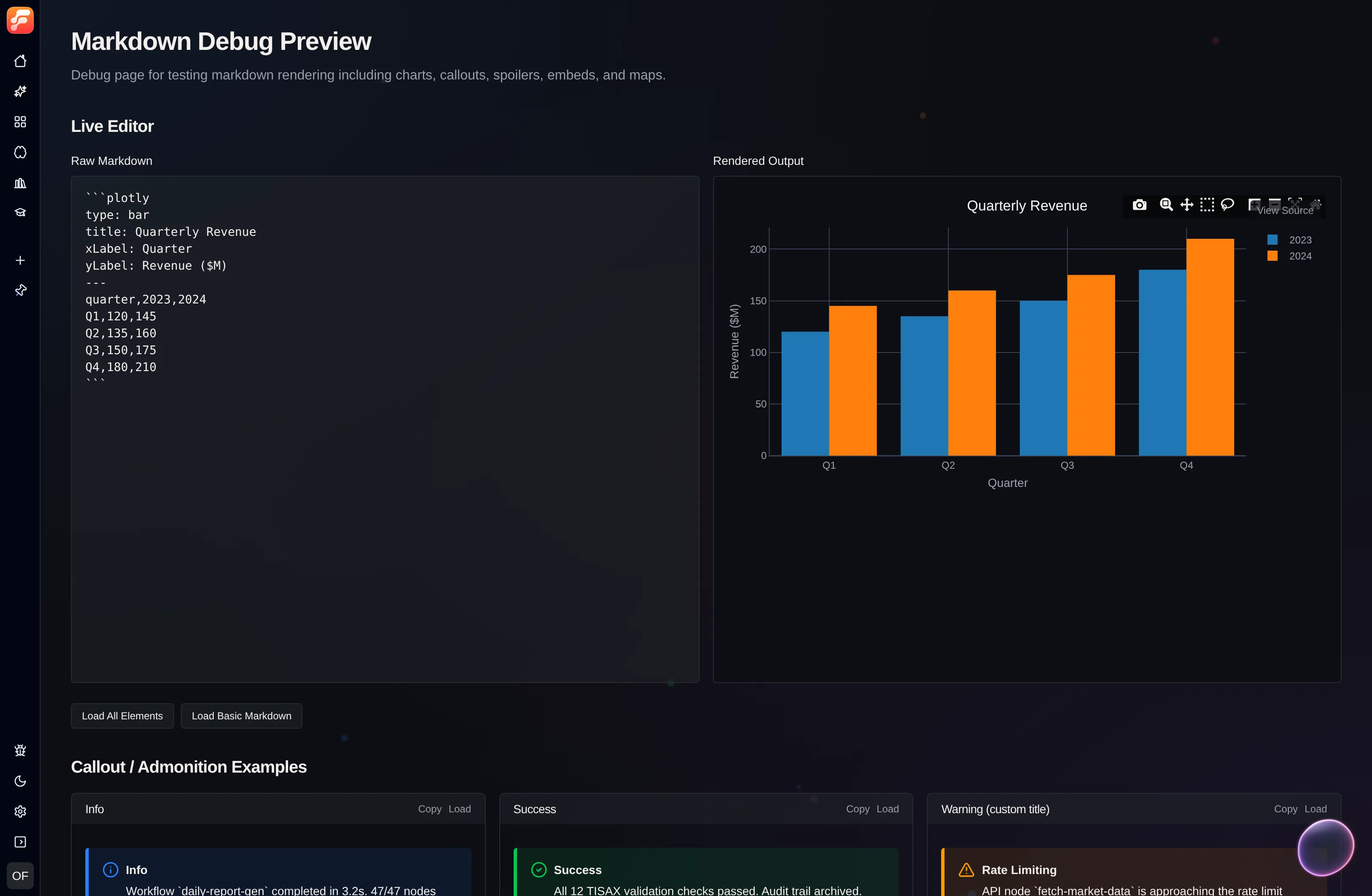
***Flow-Like extends standard markdown with interactive chart support using nivo and plotly code blocks. Charts can be defined using CSV data or native JSON configuration.
The simplest way to create charts is with CSV data and an optional configuration header:
```nivotype: bartitle: Sales by Quartercolors: paired---quarter,sales,profitQ1,150,45Q2,230,67Q3,180,52Q4,290,84```| Option | Description | Values |
|---|---|---|
type | Chart type | bar, line, pie, radar, heatmap, scatter, funnel, treemap, sunburst, sankey, stream, waffle, radialBar, chord, calendar, bump, areaBump |
title | Chart title | Any string |
xLabel | X-axis label | Any string |
yLabel | Y-axis label | Any string |
colors | Nivo color scheme | nivo, paired, category10, accent, dark2, set1, set2, set3, pastel1, pastel2, spectral, or array of hex colors |
height | Chart height in pixels | Number (default: 350) |
showLegend | Show/hide legend | true, false |
legendPosition | Legend placement | top, bottom, left, right |
stacked | Stack bar series | true, false |
layout | Bar orientation | vertical, horizontal |
animate | Enable Nivo animation | true, false |
The configuration header is a deliberately small key: value parser, not
full YAML. CSV parsing is intended for simple examples and does not implement
quoted cells containing commas; use JSON mode when the data requires those
features.
```nivotype: bartitle: Monthly Revenuecolors: paired---month,revenue,expensesJan,4500,3200Feb,5200,3800Mar,4800,3100Apr,6100,4200``````nivotype: linetitle: User Growth---month,users,activeJan,1000,800Feb,1500,1200Mar,2200,1900Apr,3100,2700``````nivotype: pietitle: Market Share---company,shareCompany A,35Company B,28Company C,22Others,15``````nivotype: radartitle: Skill Assessment---skill,Alice,BobJavaScript,90,75Python,70,85Design,80,60Communication,85,90Leadership,75,80``````nivotype: heatmaptitle: Activity Heatmap---hour,Mon,Tue,Wed,Thu,Fri9am,5,8,6,9,710am,8,9,7,8,911am,9,7,8,6,812pm,6,5,9,7,6``````plotlytype: bartitle: Quarterly Results---quarter,revenue,costsQ1,120,80Q2,150,95Q3,180,110Q4,210,130``````plotlytype: linetitle: Temperature Trend---day,temperatureMon,22Tue,24Wed,21Thu,23Fri,25``````plotlytype: scattertitle: Performance vs Experience---experience,performance1,652,723,785,857,8810,92``````plotlytype: pietitle: Budget Allocation---category,amountDevelopment,45000Marketing,25000Operations,20000Support,10000```For advanced customization, use native Plotly or Nivo JSON configuration:
```plotly{ "data": [ { "x": ["Jan", "Feb", "Mar", "Apr"], "y": [10, 15, 13, 17], "type": "scatter", "mode": "lines+markers", "name": "Series A" }, { "x": ["Jan", "Feb", "Mar", "Apr"], "y": [8, 12, 9, 14], "type": "scatter", "mode": "lines+markers", "name": "Series B" } ], "layout": { "title": "Multi-Series Line Chart", "xaxis": { "title": "Month" }, "yaxis": { "title": "Value" } }}``````nivo{ "chartType": "bar", "data": [ { "country": "USA", "value": 120 }, { "country": "UK", "value": 85 }, { "country": "Germany", "value": 95 } ], "keys": ["value"], "indexBy": "country", "colors": { "scheme": "paired" }, "margin": { "top": 50, "right": 50, "bottom": 50, "left": 60 }}```When no type is specified in CSV mode, the chart type is automatically detected based on your data:
| Data pattern | Detected type |
|---|---|
| Two columns, numeric values, and no more than six rows | Pie chart |
| Two columns with more than six rows | Bar chart |
| Three or more columns with month, quarter, or year-like labels | Line chart |
| Other tabular data | Bar chart |
Use Semantic Headings
Structure your content with proper heading hierarchy (h1 → h2 → h3).
Keep Tables Simple
For complex data, consider using charts instead of large tables.
Choose the Right Chart
Use bar charts for comparisons, line charts for trends, pie charts for proportions.
Test Your Markdown
Use the debug playground to preview formatting.
Test all markdown features interactively:
The playground provides: