
One reusable job
Keep a Widget focused enough that its name and public actions are obvious.
This walkthrough applies the A2UI Widget model to a reusable status card. Enable Developer Mode first. For the general creation task, see Create Widgets; for exact editor controls, use Visual Builder controls.
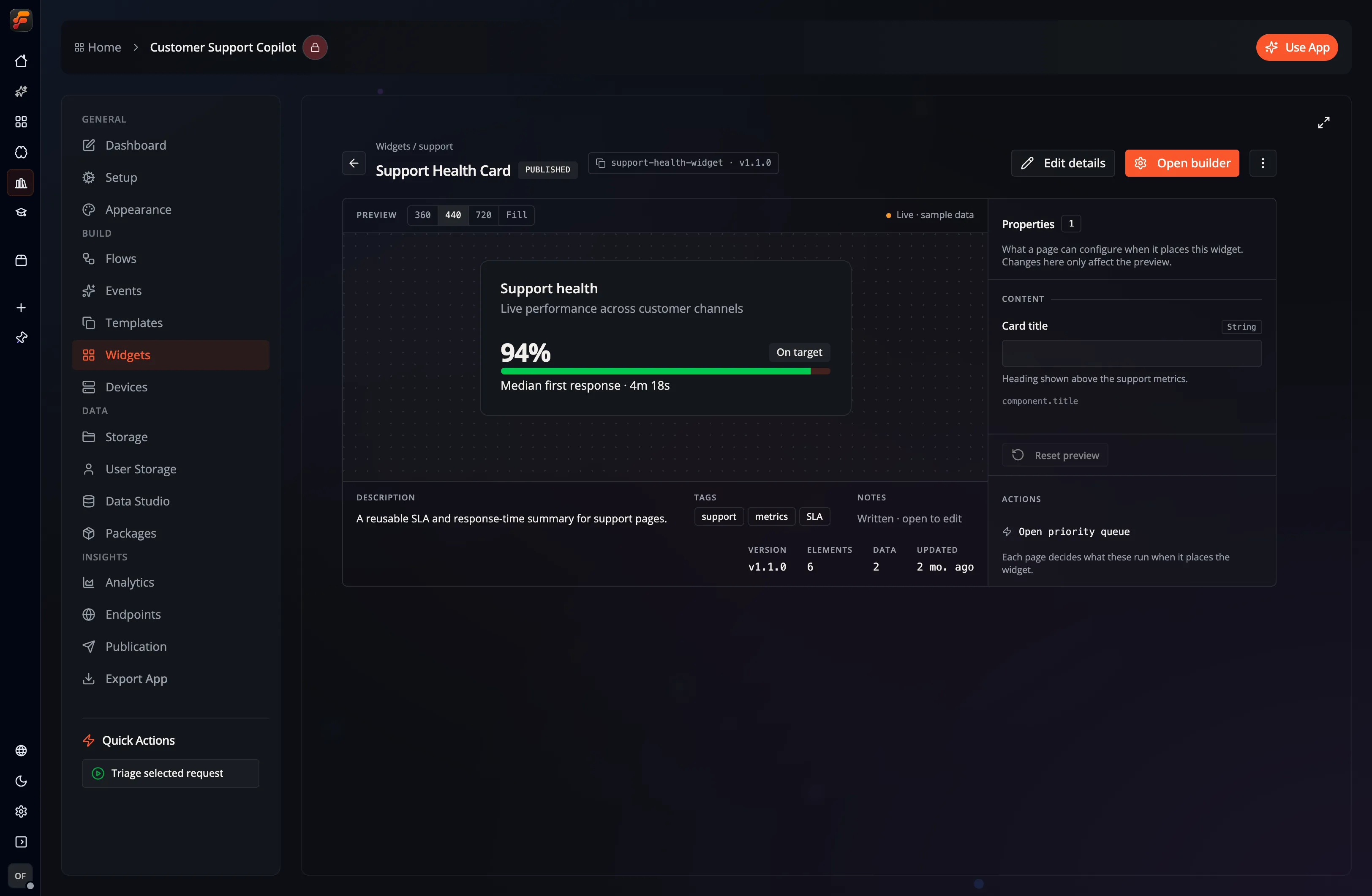
New Widgets are blank. The current creation flow does not include a template picker or a separate package-publishing wizard.
| Area | What it controls |
|---|---|
| Components | Components that can be added to the Widget |
| Hierarchy | The normalized component tree and selection |
| Canvas | Live rendered Widget surface |
| Inspector | Properties, bindings, layout, style, and actions for the selected component |
| Dev Mode | Underlying normalized JSON for inspection or validated editing |
| Preview | Rendered Widget at a selected responsive size |
| Settings | Widget metadata, Events, Versions, and technical information |
The header also provides copy, cut, paste, delete, save, and preview controls. Component changes are saved after a short debounce; Save Now flushes a pending change immediately.
This example creates one focused, reusable surface.
Create the outer layout
Add a card or column as the root. Use semantic theme classes such as
bg-card, text-card-foreground, and border-border.
Add the visible content
Add a heading text, a value text, a badge for state, and an optional
progress component.
Organize the hierarchy
Put related text in a column, place the badge beside the heading with a
row, and keep the component tree shallow.
Bind dynamic values
Select a supported property in the Inspector and bind it to the Widget data model, or leave it as a useful literal default.
Add an interaction
Define a named Widget Event in Settings → Events, add a button, and
configure the button action to emit that Event.
Preview edge cases
Check narrow width, long labels, empty values, loading state, keyboard focus, and both themes.
The Widget runtime and bindings reference owns the persisted model and state API. The examples below show selected component properties; they are fragments to use inside a Widget’s component tree.
Static properties use literal BoundValue objects:
{ "type": "text", "content": { "literalString": "Service status" }, "weight": { "literalString": "semibold" }}A data-bound property uses a path:
{ "type": "text", "content": { "path": "$.data.status.label", "defaultValue": "Unknown" }}Use element-specific workflow nodes when a Flow owns the visible value:
Keep the Widget data model for values intentionally shared by several components.
Open Settings → Events to define the interactions the Widget exposes:
interface WidgetAction { id: string; label: string; description?: string; icon?: string; contextSchema: WidgetActionContextField[];}An interactive component inside the Widget triggers one of those IDs:
{ "type": "button", "label": { "literalString": "Acknowledge" }, "actions": [ { "name": "widget_event", "context": { "actionId": "acknowledge" } } ]}widget_event is the runtime action type; context.actionId selects the
Widget action. That Widget-level action must exist before a containing Page
can bind it to behavior. Use one descriptive action per purpose rather than
routing every button through a generic catch-all.
An exposed property maps an instance-facing option to one internal component property:
interface ExposedProp { id: string; label: string; description?: string; targetComponentId: string; propertyPath: string; propType: | "String" | "Number" | "Boolean" | "Color" | "ImageUrl" | "Icon" | "Json" | "TailwindClass" | "StyleObject" | "BoundValue" | { Enum: { choices: string[] } }; group?: string;}For example, expose the outer card’s accent class, a heading’s content, or a
metric’s bound value. Keep internal spacing and structure private unless a Page
author needs to change them.
At present, these definitions are mainly populated through validated JSON or agent tooling and displayed by the Widget details experience; the visual Settings panel does not provide a complete exposed-property editor.
Select Settings in the builder header.
Edit the name, description, and tags, then select Save Metadata.
Add, rename, describe, or remove Widget Events, then select Save Events.
The Versions tab loads existing snapshots and creates a new Patch, Minor, or Major snapshot. Creating a version saves the current Widget first.
| Version | Use when |
|---|---|
| Patch | Correcting a compatible implementation detail |
| Minor | Adding compatible content or behavior |
| Major | Changing behavior or structure that existing uses should review |
There is no release-note form or separate Publish step in the current builder.
Advanced shows the Widget ID, root component ID, selected version, timestamps, component count, and data-model entry count. These fields are informational.
Open a Page in the Page Builder, locate the Widget in the component palette,
and drag it into a compatible container. The Page stores a Widget reference
and creates a widgetInstance component:
{ "type": "widgetInstance", "instanceId": "widget-status-card-instance", "widgetId": "status-card", "appId": "app-id", "exposedPropValues": {}, "actionBindings": {}}The Page owns the instance reference and configuration; the original Widget continues to own its reusable component tree.
One reusable job
Keep a Widget focused enough that its name and public actions are obvious.
Useful defaults
A newly inserted Widget should render meaningful placeholder content before data is connected.
Theme-safe color
Prefer semantic theme tokens and verify light and dark mode.
Accessible states
Label inputs, describe images, preserve focus order, and make loading and error states visible.