
Chat UI
Add a Chat UI event to an app to expose its flow as a chat interface. See Events for event setup.
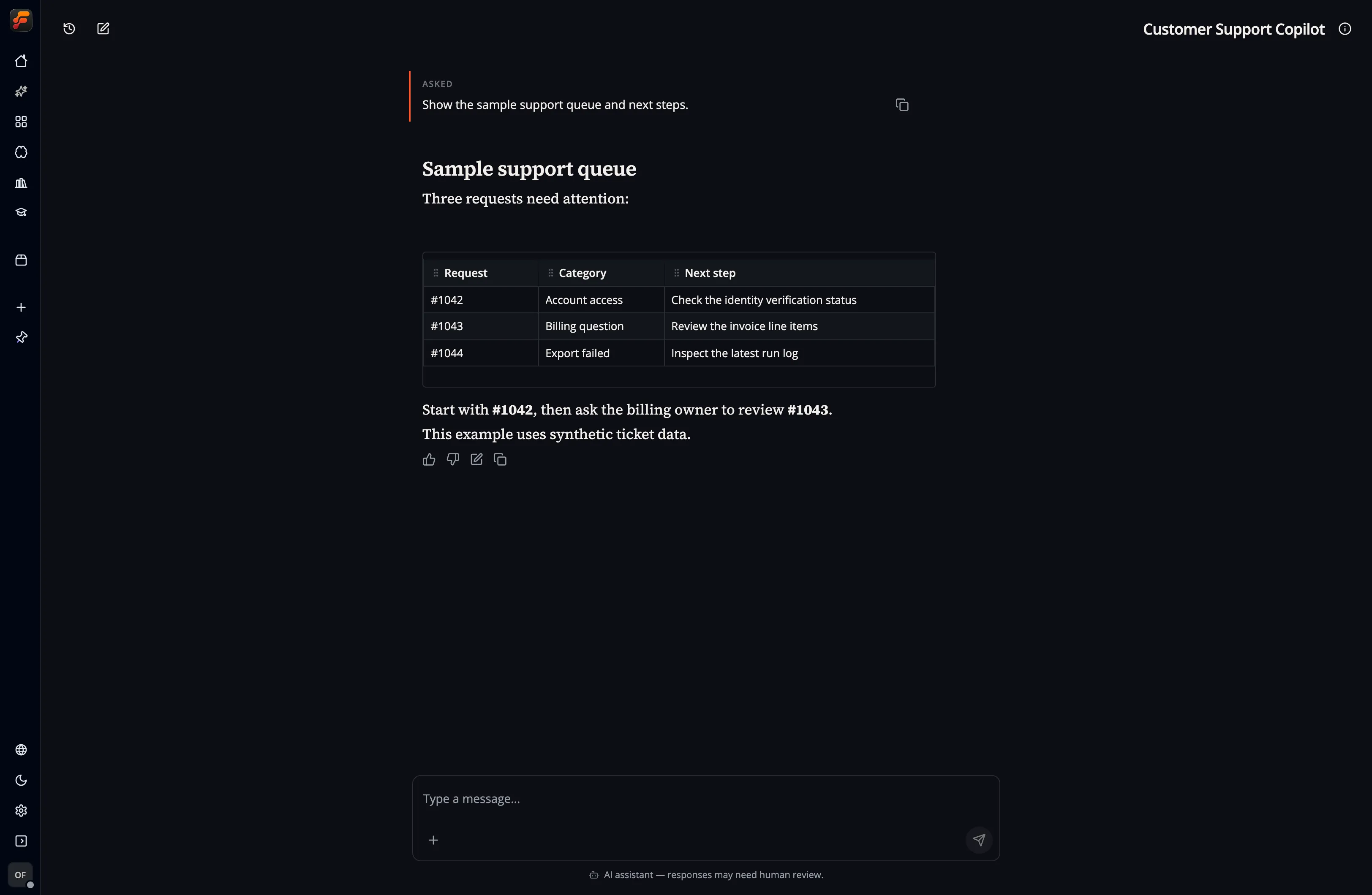
This capture uses a synthetic conversation to show the message layout, table, response controls, and composer. It does not show a live model run.
Appearance
Section titled “Appearance”The event configuration provides:
- Background image selected from app storage or provided as an external URL.
- 20 theme presets ranging from professional layouts to Cyberpunk, Typewriter, Neon Grid, and animated Aurora Glass styles. Presets follow the app’s current light or dark mode.
- Custom CSS, edited with the built-in Monaco editor.
- AI disclosure text that is always visible so people know they are chatting with AI. State that the responses come from AI and explain any limits relevant to the task.
Selecting a theme copies its complete CSS into the editor. Change any part of that CSS and the theme selector immediately changes to Custom. Selecting a preset again replaces the editor contents with that preset’s canonical source.
The built-in set includes Flow Like, Executive, Editorial, Typewriter, Neon Grid, Aurora Glass, Green Screen, Blueprint, Swiss, Nordic, Brutalist, Art Deco, Solarpunk, Noir Cinema, Pixel Arcade, Cyberpunk, Synthwave Sunset, Oceanic, Candy Pop, and Zen Garden.
When you select a background from app storage, the event keeps its stable storage path. Chat UI requests a temporary signed URL when it loads, so signed credentials are never saved in the event configuration.
Custom CSS
Section titled “Custom CSS”Custom CSS is sanitized and scoped to this Chat UI. Use :root for chat-wide variables; here, :root means this chat only, not the app or document root.
:root {  --primary: #7c3aed;  --fl-chat-content-width: 52rem;  --fl-chat-message-radius: 1.25rem;  --fl-chat-background-overlay: rgb(0 0 0 / 35%);}
[data-fl-chat-message="assistant"] {  border: 1px solid var(--border);}
CSS variables
Section titled “CSS variables”| Variable | Controls |
|---|---|
--background | Base chat background color |
--foreground | Default text color |
--primary | Primary/accent color |
--primary-foreground | Text and icons on the primary color |
--muted | Muted surface color |
--muted-foreground | Text and icons on muted surfaces |
--border | Default border color |
--fl-chat-content-width | Maximum width of chat content |
--fl-chat-message-radius | Message bubble corner radius |
--fl-chat-surface-background | Welcome and conversation surface background |
--fl-chat-composer-background | Composer background color |
--fl-chat-user-message-background | User message background color |
--fl-chat-user-message-foreground | User message text color |
--fl-chat-ai-message-background | Assistant message background color |
--fl-chat-ai-message-foreground | Assistant message text color |
--fl-chat-disclosure-background | AI disclosure background color |
--fl-chat-disclosure-foreground | AI disclosure text color |
--fl-chat-background-overlay | Overlay rendered over the background image |
--fl-chat-background-overlay-strong | Stronger overlay toward the lower page |
--fl-chat-background-size | Background image sizing, such as cover or contain |
--fl-chat-background-position | Background image position |
--fl-chat-pad-bottom | Extra space below the chat content |
Stable selectors
Section titled “Stable selectors”Use these stable hooks for more targeted styling:
[data-fl-chat-surface][data-fl-chat-welcome][data-fl-chat-welcome-panel][data-fl-chat-suggestion][data-fl-chat-messages][data-fl-chat-message="user"][data-fl-chat-message="assistant"][data-fl-chat-composer][data-fl-chat-ai-disclosure]